Qlikview series: accessibility and usability
In the next two blog posts from the Business Intelligence Team, we will take a quick look at accessibility and usability from a QlikView perspective. This post covers elements of interface design, with a follow up post on how we approach building our dashboards to address the various difficulties our users may face.
Accessibility and usability are key factors when designing on-screen interfaces. The practise of this design is often HCI, or Human Computer Interaction design. The designer needs to make sure that the interfaces being put together meet a range of requirements to ensure convenient content delivery to the widest possible audience.
We aim to design an interface that provides an easy way for people to view and interpret the data they need for their work. Engaging with the dashboard should be smooth and intuitive, with information presented logically and consistently. This should help to minimise the cognitive load on the user and allow them to derive the maximum amount of insight.
Template
We maintain a template dashboard that is used as a foundation for most of our developments. It holds our colour schemes and lays out where different elements of the dashboard will display by default.
Let us use an actual dashboard example to go over some of the design elements we incorporate.
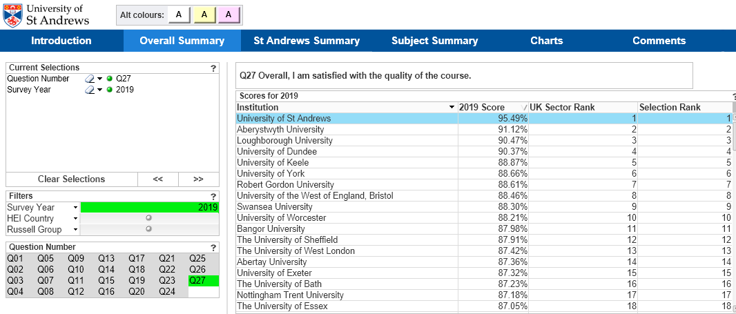
This is an extract from the National Student Survey dashboard which is used to view the results from the Office for Students’ annual student survey dataset.
At the top left you can see the university logo, and the alternative colour scheme picker. (This is an accessibility item that will be covered next post).
The blue banner runs along the top of the display area and allows the user to see what sections are available within the dashboard, with the current section highlighted.
The current selections box is shown top-left if it is always visible. There is a button on the QlikView toolbar, displayed below, that will display a current selections pop-up box if required.

Below the current selections box, quick-select buttons and dropdown selections are listed to allow the user to make selections that impact the tables and charts on the page.
Tables and charts
The rest of the page is used to display the tables and charts. These can usually be used to search and make selections by clicking on the title to display a dropdown list. Clicking on a cell of the table will also select that datapoint and filter the data. In some cases, this may be disabled.
As the dashboards are bespoke, we often include elements to improve clarity for the user. In the case of the dashboard image above, the text associated with the question number is displayed above the table to allow the user to interpret the information in the table.
Data relationships: green/white/grey
QlikView allows users to see relationships between the data items selected and the other data. Green shows that a selection has been made, white shows items related to the selected data, and grey shows items that are unrelated to the selections. Making a grey selection will reset some or all selections and change the display to show the relevant data.
If users want to do their own custom analysis, tables can be exported to Excel by right clicking on the table and selecting ‘Export to Excel’ from the dropdown.
More
Thank you for your interest in our team and this topic. A follow up blog post on accessibility elements is in the pipeline. If you would like to know more about interfacing with the BI dashboards, please check out our Training dashboard and try it for yourself.